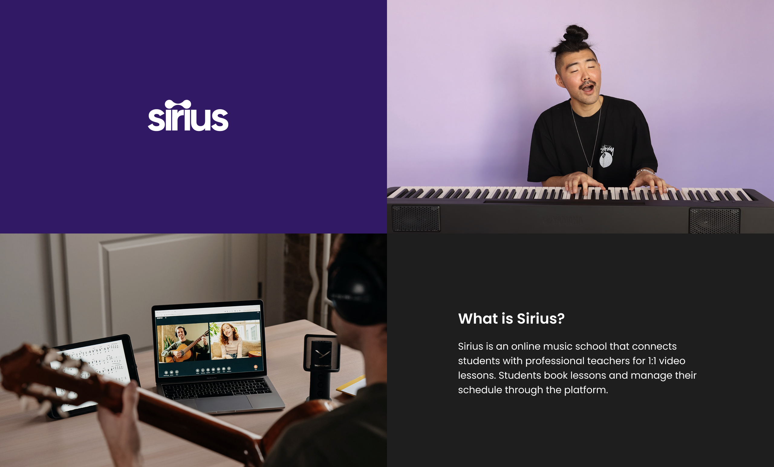
Simplifying the path to musical mastery at Sirius
IA Redesign · Product Strategy · Responsive web design
Web app redesign to improve navigation, lesson management, and overall usability for online music students.
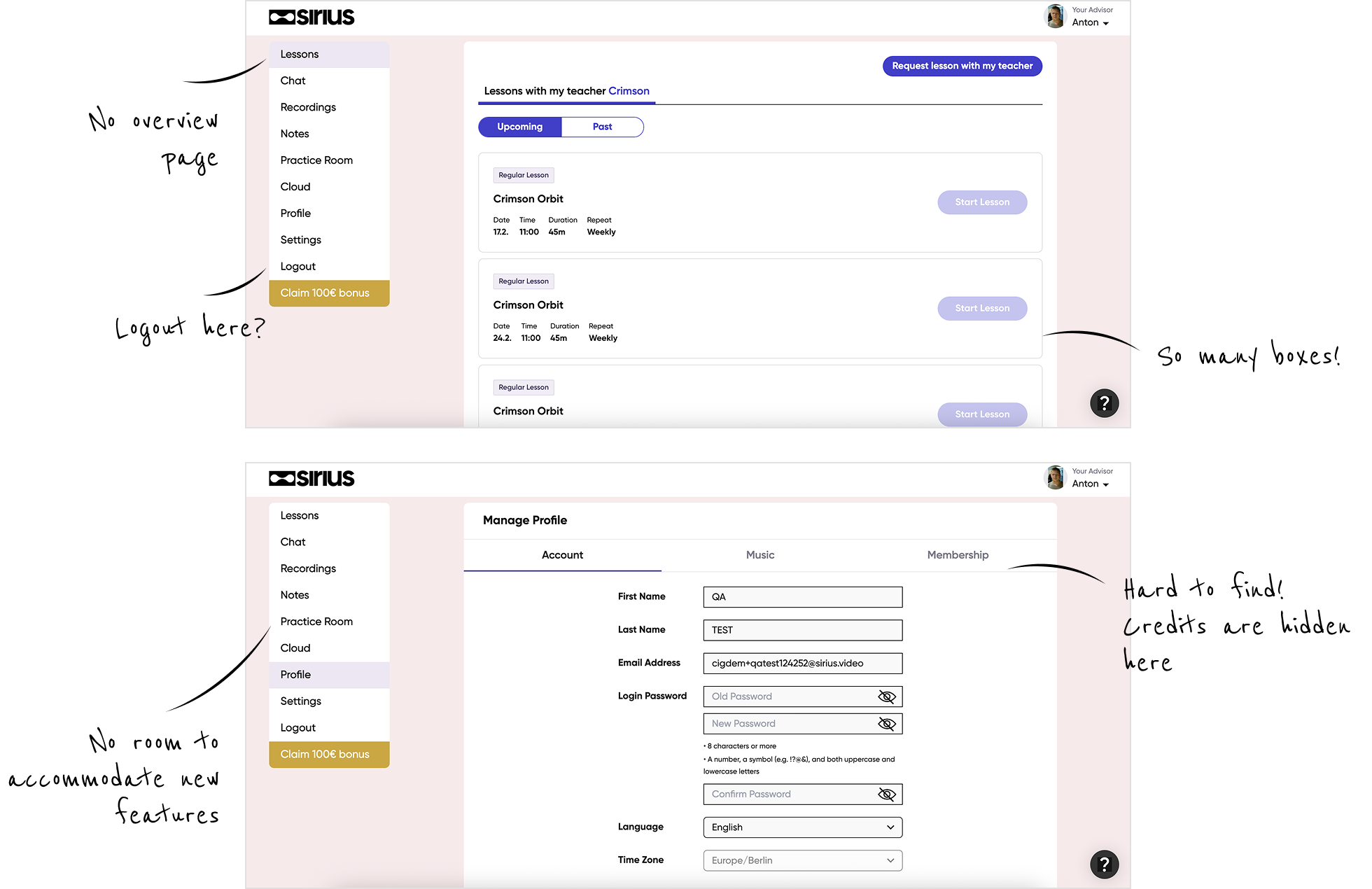
The existing student app had accumulated significant design and technical debt over several years. Navigation was confusing, key features were buried, and the mobile experience was essentially a cramped desktop layout. Students struggled with basic tasks like finding their next lesson or checking how many lessons remained in their package.
This was not just a visual refresh. The real problem was structural. Core problems identified:
Hidden critical information: Lesson balance wasn’t visible at a glance
Structural scalability issues: The existing navigation structure did not support product growth or the integration of new features.
Broken mobile experience: Desktop-only layouts made mobile interactions frustrating
Outdated and visually inconsistent interface: The UI lacked visual polish and consistency, which reduced perceived trust and professionalism.
This project came with real-world constraints that shaped every design decision:
Solo designer: I owned the entire design process: research, strategy, UI, handoff, and design QA
Live product: Couldn't break existing flows; needed phased rollouts
Significant design debt: Multiple legacy patterns and no cohesive design system
Limited engineering capacity: Prioritization and scope control were critical
No immediate post-launch metrics: Design is still being implemented; impact measurement is future work
Status quo
Before redesigning anything, I needed to confirm whether the problem was aesthetic or usability & clarity. I used asynchronous methods to validate assumptions and understand student behavior:
Intercom conversations: I sent a targeted survey to active students to understand frustrations and needs.
.png)
Typeform survey: I sent a targeted survey to active students to understand frustrations and needs.
Credit system is the #1 pain point (high risk): Users do not trust the current credit/subscription model. The mental model is broken: they don’t understand what they own, what they’ve used, or what they’re paying for.
“I have no clue how many lessons I have left.”
— Student (Survey respondent)
Learning progress is important but poorly visible: Users are emotionally invested in learning, but the platform does not yet reflect their growth back to them. Progress exists — it’s just not visible or structured.
Given the constraints and research insights, I established three guiding principles:
Design for growth
New features should fit naturally, not add friction
Make system status visible
Students should always know where they stand
System-level thinking
Design decisions should strengthen the whole ecosystem
Rather than redesigning individual screens in isolation, I approached this as a system redesign. I created a lightweight design system with consistent components, spacing, and interaction patterns that could be applied across the entire app.
My design approach / IA & wireframes

Restructured information architecture
The old navigation had grown organically, feature-drivenand new features didn’t fit with it anymore.
I grouped features by user intentSeparate “learning” from “administration”.
This also meant that the whole platform would have a new layout.
.png)
.svg)
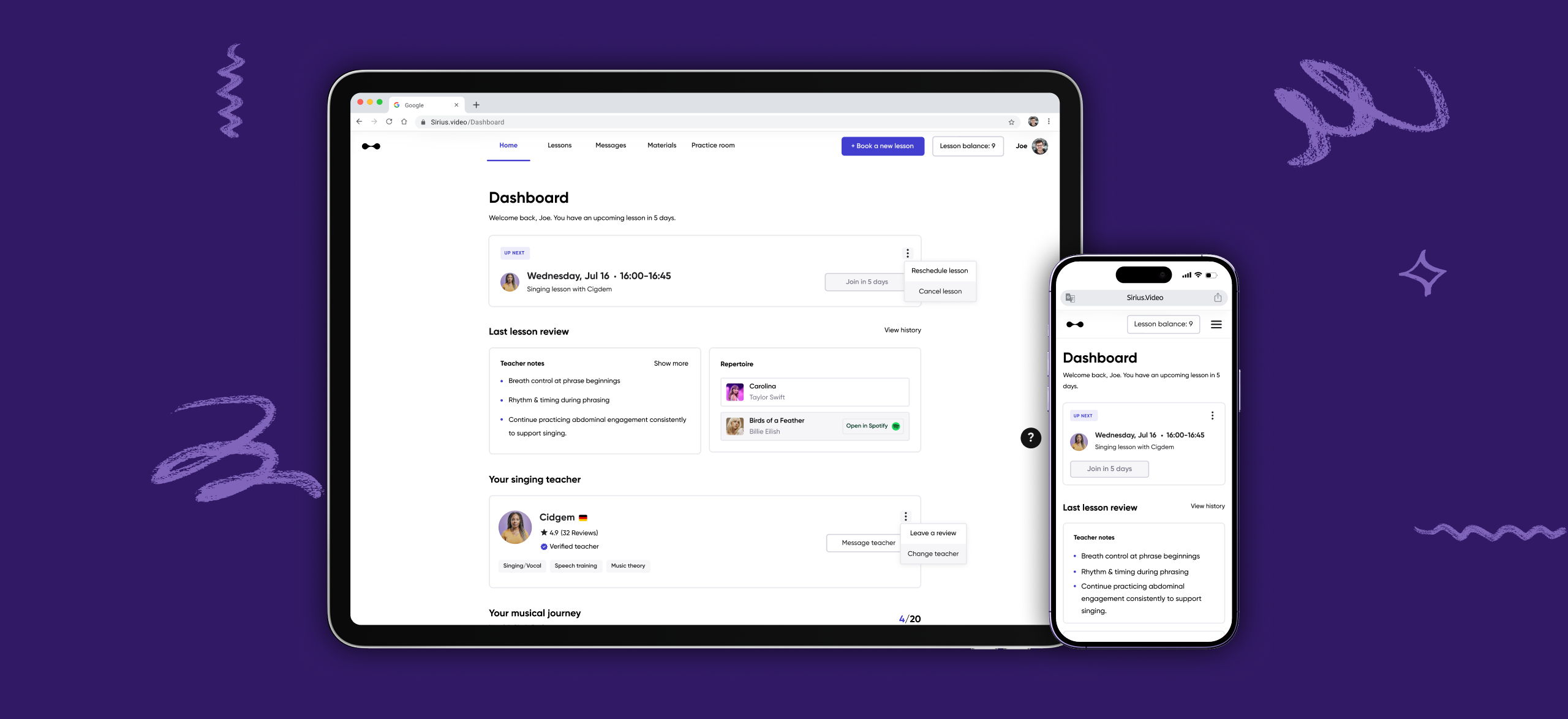
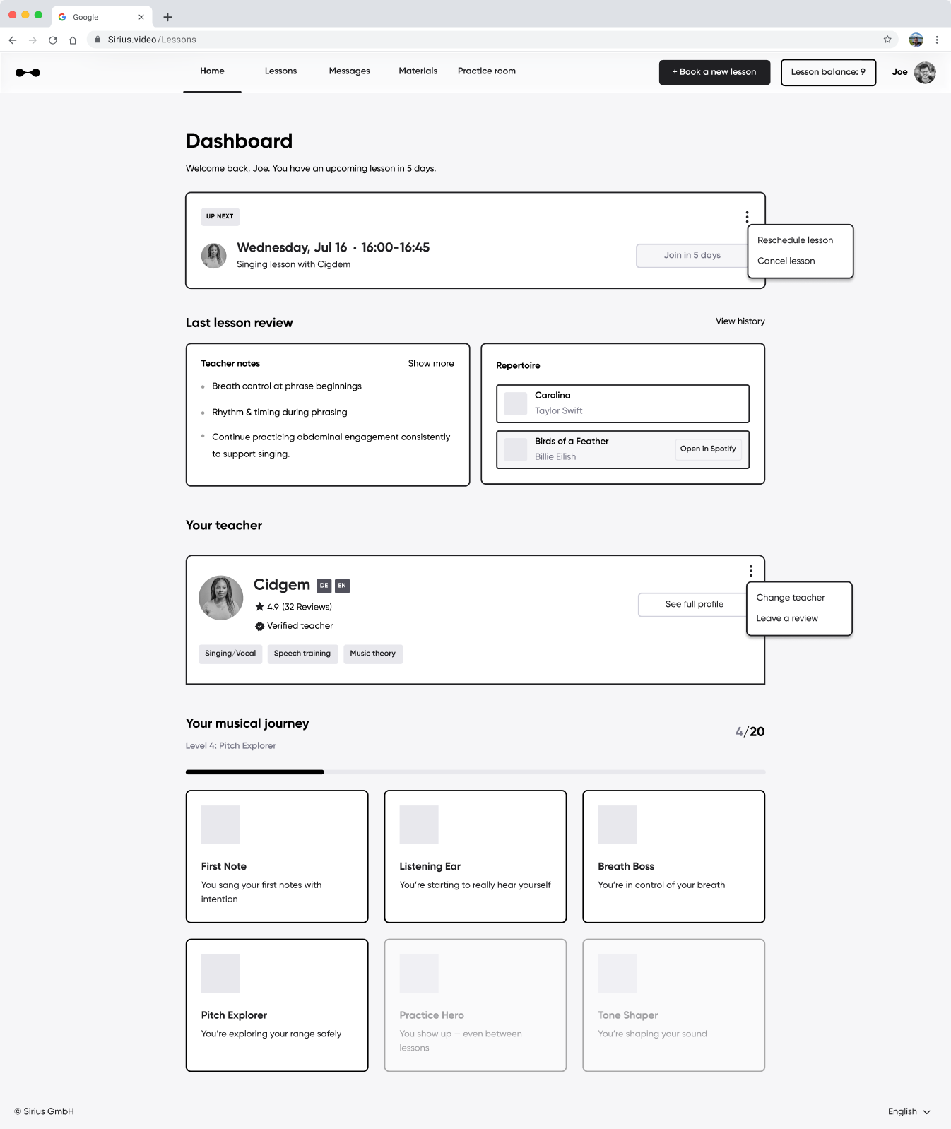
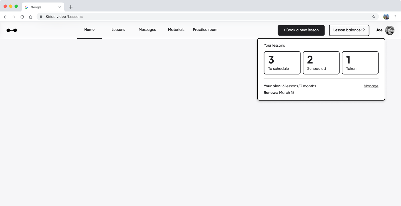
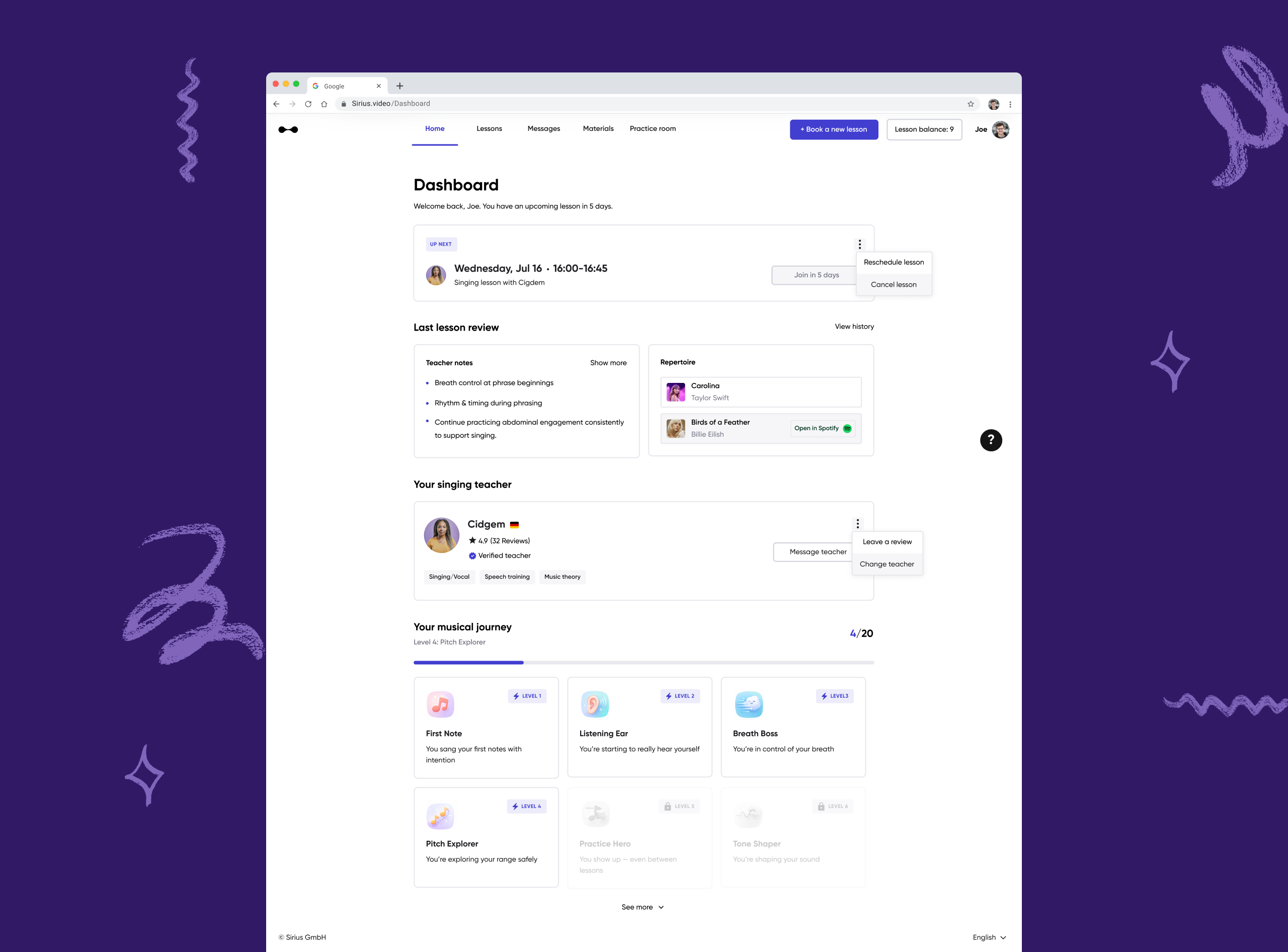
Introduced a home / dashboard
.svg)
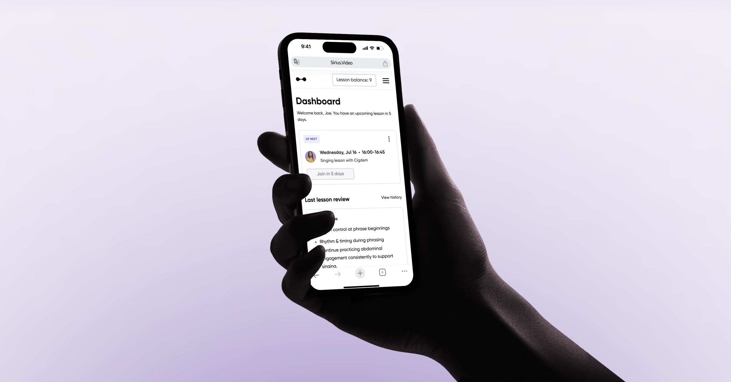
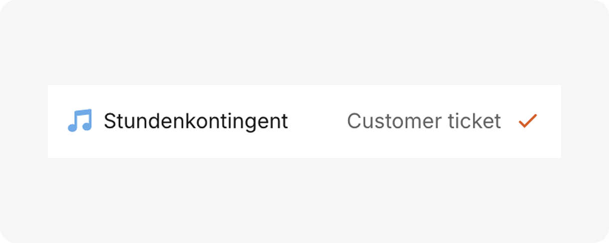
Made lesson balance explicit
One of the highest-friction issues:Students didn’t know how many lessons they had left. This led to: support tickets, & anxiety.
I added lesson balance visibility directly in the top navigation, making it always accessible, impossible to miss & consistent across screens
This is a classic visibility of system status fix — simple, but high impact.
.svg)
Rebuilt the mobile experience
I rebuilt the experience from the ground up by redefining the information architecture, establishing mobile-specific interaction patterns, and designing for touch-first behavior.

Before handoff to engineering, I conducted lightweight usability testing with 6 current students using a simple Figma prototype.
Testing method: Task-based scenarios (e.g., "Find your membership," "Check how many lessons you have left," "Find your lesson summaries").

*User agreed to have their name and picture used for this case study
Task success rates
100%
5/6
Key findings (improvements)
Users assumed “teacher notes” were manually written by the instructor. It was unclear that the notes were automatically generated from the lesson recording.
The term “Repertoire” was not immediately understood. Users did not recognize that it referred to the songs practiced in their most recent lesson.
Shipping structural change without disrupting active students
Because Sirius is a live, revenue-generating product, a full redesign release would have introduced unnecessary risk. Instead of a big-bang launch, I sugested a phased rollout to balance immediate impact with long-term scalability.
Phase 1: Research showed lesson credit confusion was a top friction point. Rather than waiting for the full redesign, we shipped lesson balance visibility within the existing IA and UI.
Phase 2: Before changing layouts, we plan to build scalable core components like the new navigation system, standardize dropdowns and menus, etc.
Phase 3: With foundational components ready, we will slowly re-build each page.
The designs are currently in implementation. Once launched, we will measure success via:
Reduction in support tickets
% decrease in tickets related to lesson balance
In-product micro survey:
To measure increased perceived clarity
Lesson Consumption Rate
% of purchased lessons completed
Design for growth: Initially, I tried to design "pages." I quickly realized I needed to map all "states" of the app. This is a job that needs to be done working closely together with engineering.
Design debt is real: Working on a live product with years of accumulated design debt taught me the importance of incremental improvement. I couldn't redesign everything at once, so I had to prioritize and design for phased rollouts